Street Address
San Francisco, CA
(401) 368-3309
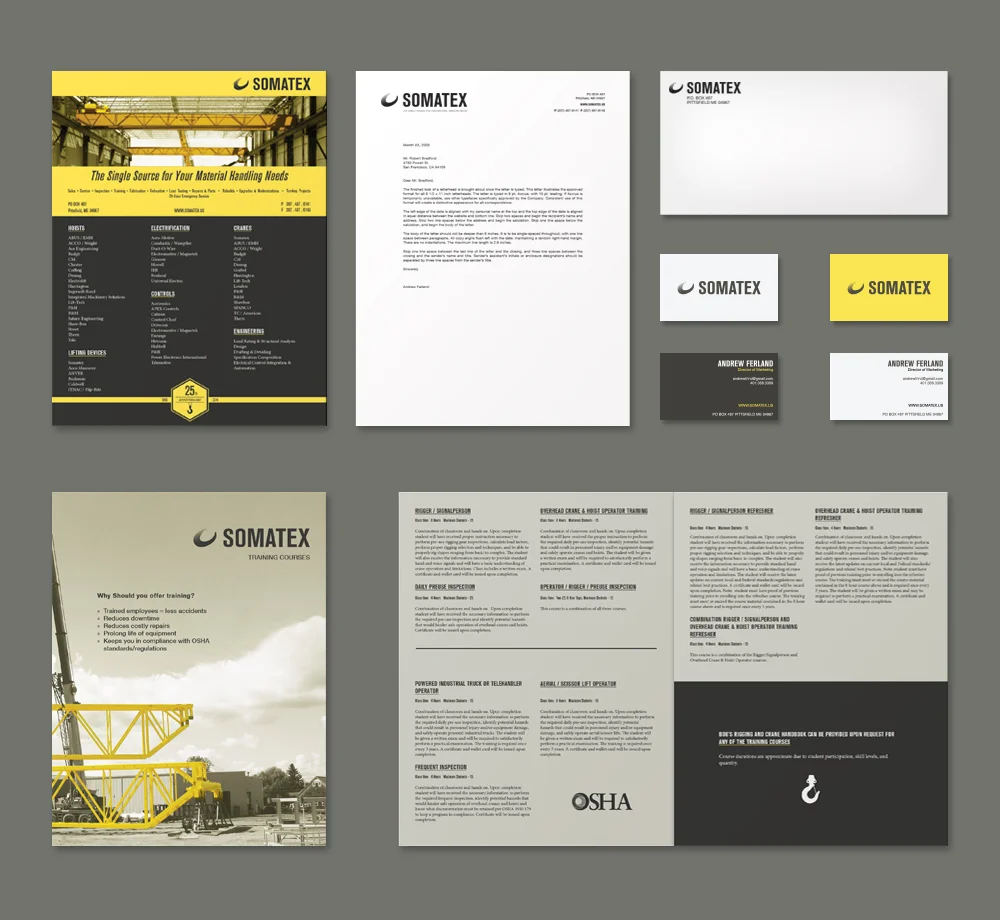
The Somatex rebranding first changed the logo to make it simple and bold. The design stripped away the previous ornaments and extra text in order to make room for simplicity and modernism. The logo was redone in three colors to make the logo mark and the text pop from a dark background. A gradient was used to further emphasize the image of a hoist, which was previously portrayed as a solid color. The new color scheme and mark treatment ties the whole branding together, bringing yellow and grey together to make a unified aesthetic approach. These designs were set across multiple mediums, like the website, brochures, and stationery.
L / 2013 logo | R / 2014 logo
WEBSITE ICONS
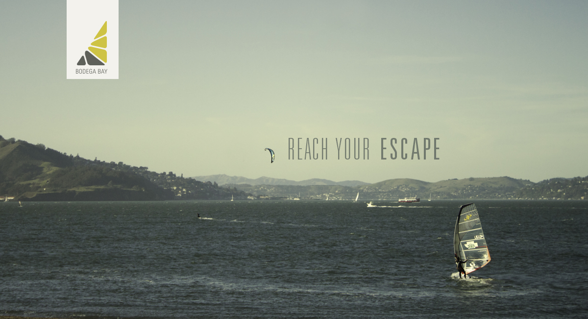
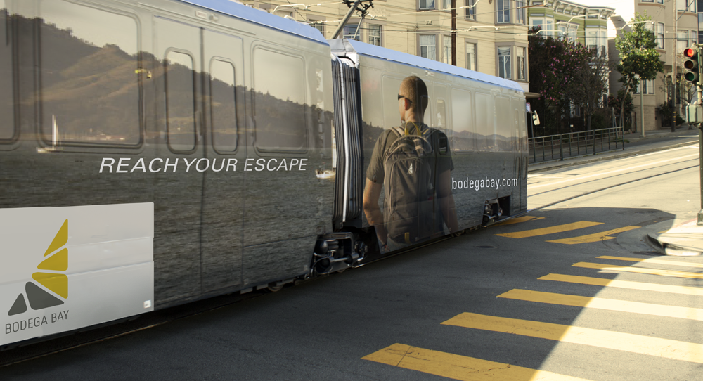
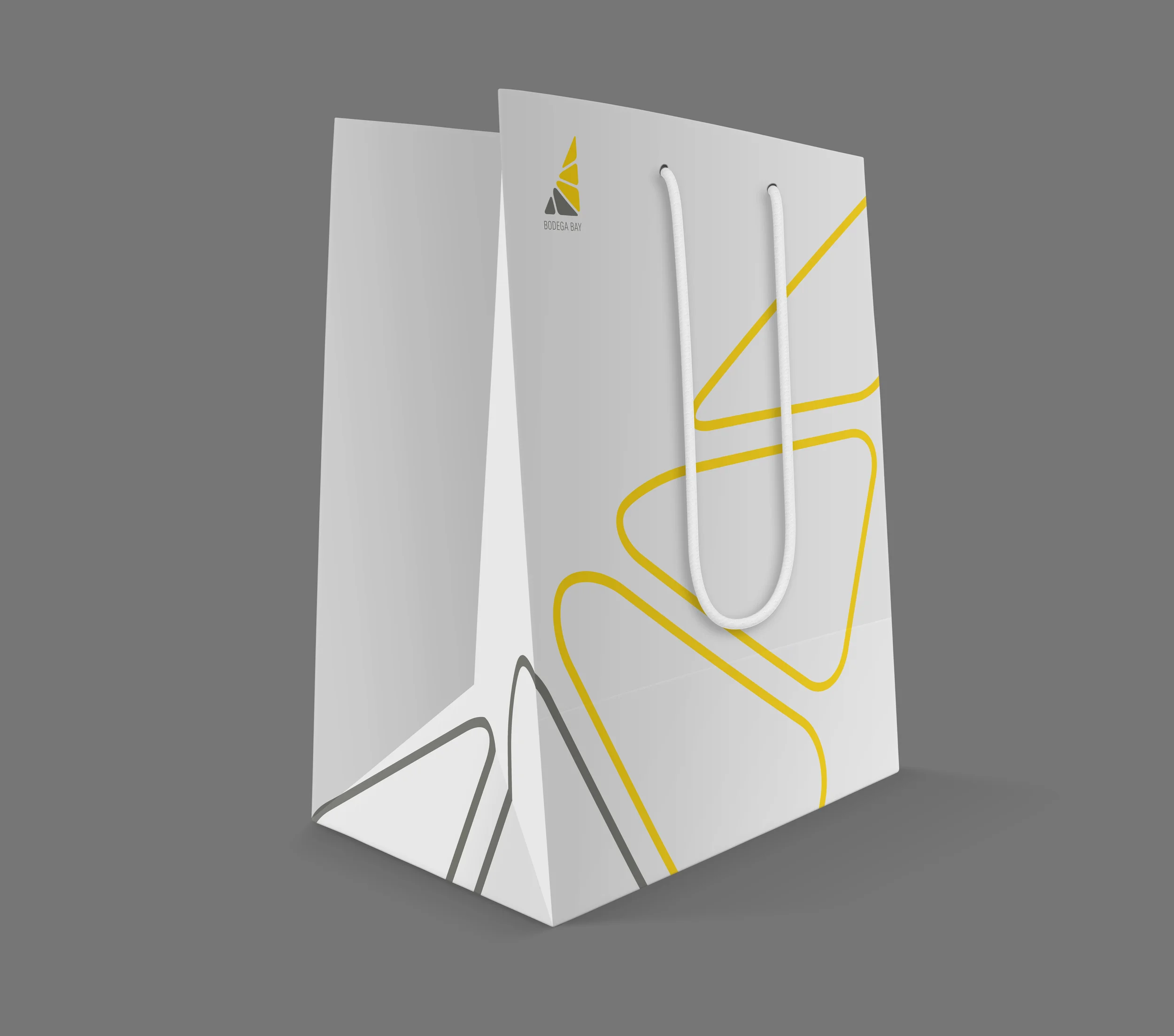
Bodega Bay is a concept brand that promotes outdoor activities within and around large cities. The branding and design portrays a clear relationship between nature and urbanism. To establish this, the typography was designed in multiple weights to contrast adventure and elegance. Using blue and yellow reinforces this relationship by showing up prominently in both settings: surf and sun, concrete and taxis, etc. The signature imitates the organic shapes found in nature and the divided footprints of city blocks.
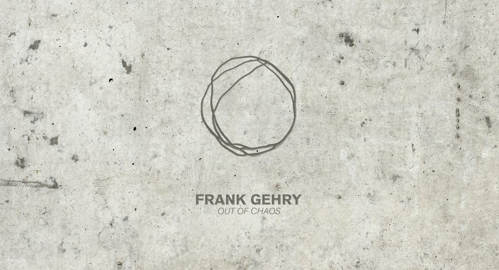
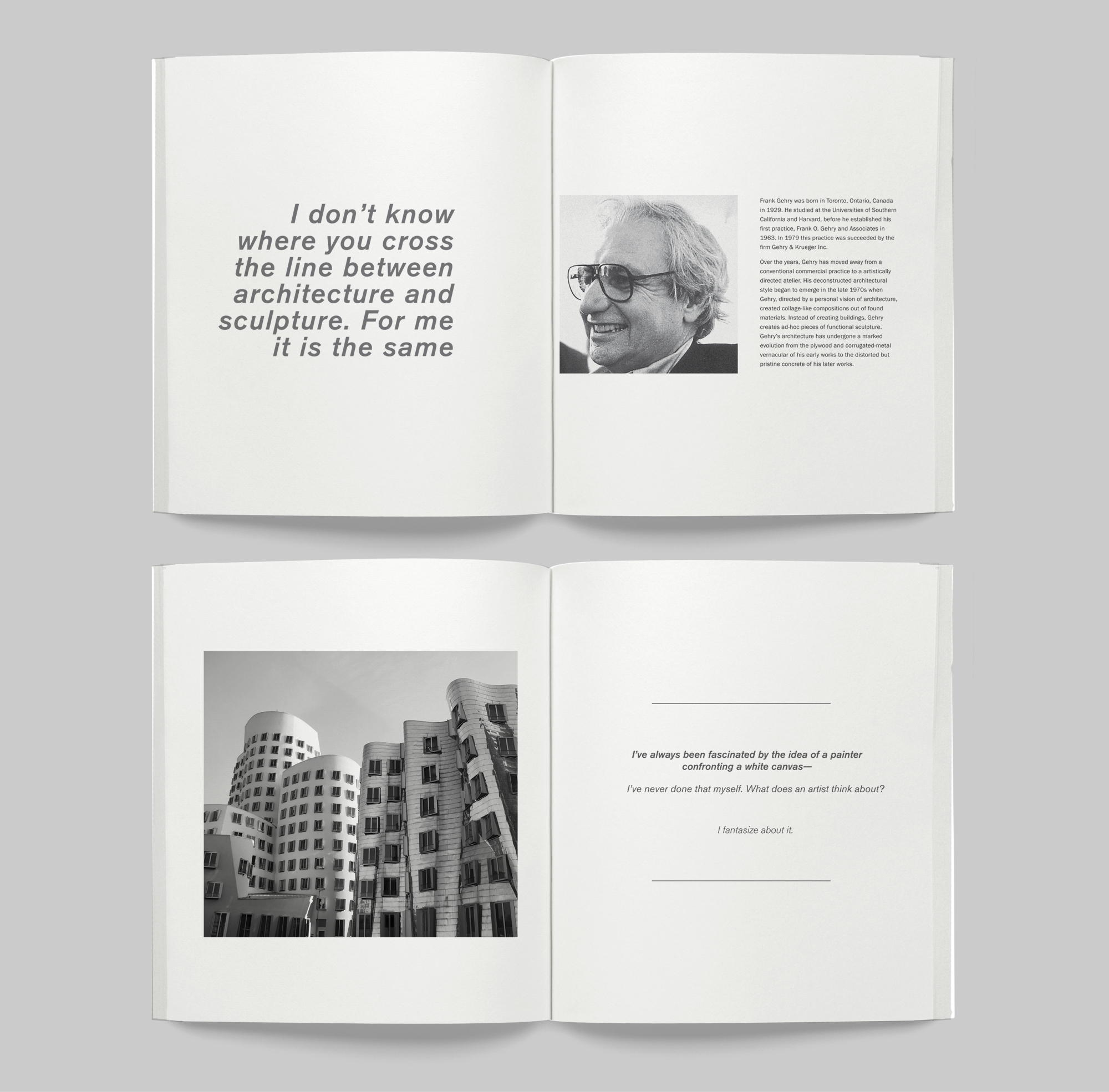
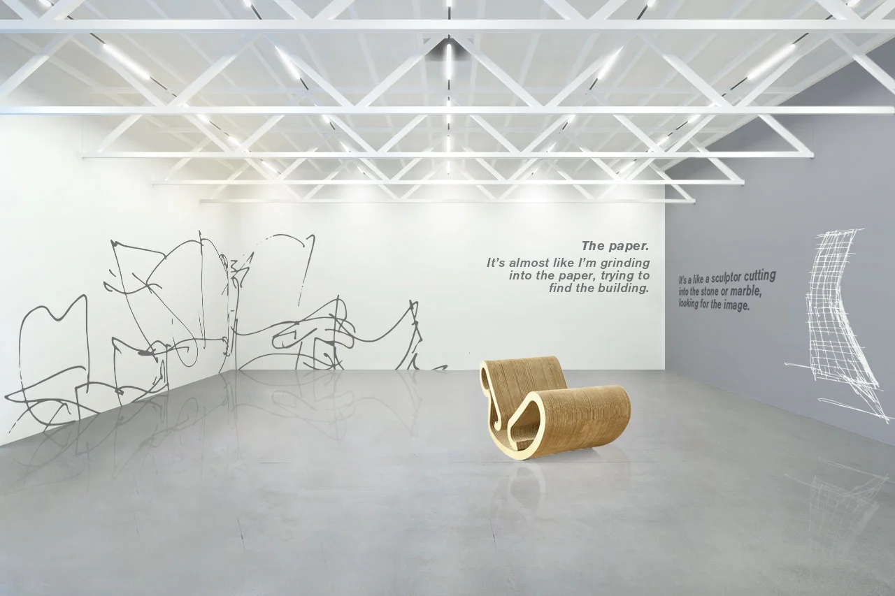
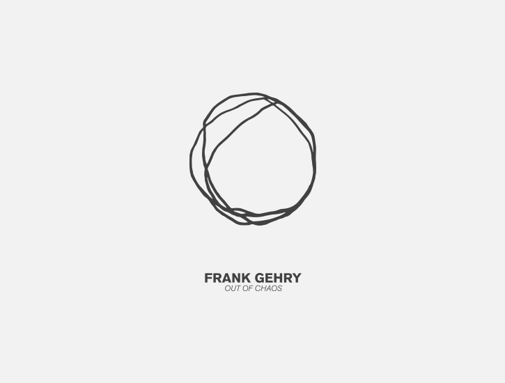
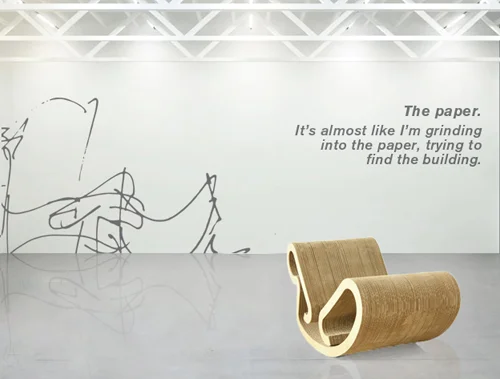
Out of Chaos is a museum exhibition created around the work of Frank Gehry. This exhibit focuses on his conceptualizing processes through sketches, model making, and other design outlets. To display his unique approach to design, a whole range of elements were created to market this event. The concept behind the design approach was to showcase Frank Gehry as a fine artists. and to show off his work in the ways famous paintings and sculptures are displayed. The identity was created in the style of Gehry’s famous sketches, and paired with a grotesk typeface to contrast the organic line quality of the mark. The marketing materials is finished in a brownish grey color scheme to bring a sense of warmth and craft in an elegant setting. This was a collaboration between De Sergio Villalona and Amaline Bassetti.
Please note, any existing businesses used or google images obtained (although modified) are strictly for educational purposes. No financial gains were made from these materials.
Rockstar Energy is a brand that is geared towards a younger audience with connections to sports, rock music, and racing. The goal of this new campaign is to draw a more serious approach to this market and target generation x consumers. This was done by contrasting the idea of responsibilities with emergency vehicles and airplanes. This allows the viewer to make the connection of how Rockstar Energy is an important tool in a very energy demanding world. It also represents more maturity around the brand image that has been mired by people abusing the use of energy drinks in party scenes. “Great responsibilities demand more energy” is a call to generation x while a caution for people who already recognize the existing brand.
Please note, any existing businesses used or google images obtained (although modified) are strictly for educational purposes. No financial gains were made from these materials.
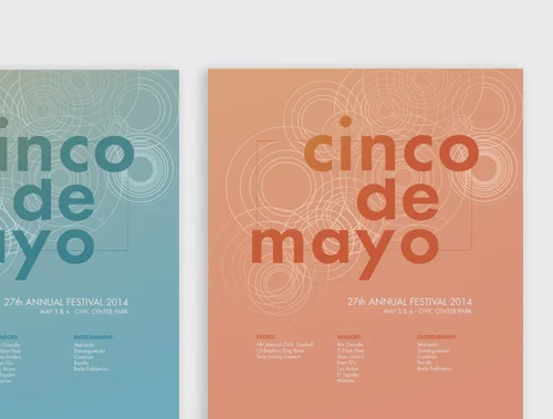
Denver holds one of the largest Cinco de Mayo festival in America, attracting thousands of people each year. Branding was created to unify the whole organization and bring identity to the event. The goal of the branding was to reflect the excitement of the festival in a clean, modern aesthetic. For the logo, a bold, painted typeface was created to mimic the colorful, loud, exciting, and chaotic nature of the event. Along with the logo, a clean geometric pattern was created to contrast the scratchy shapes of the designed typeface. The circular pattern reflects sound waves from the brass music and to capture the loud excitement of the event.
Please note, any existing businesses used or google images obtained (although modified) are strictly for educational purposes. No financial gains were made from these materials.
The brand CANNA is a company that investigates the concept of legalized cannabis sold in everyday stores. The goal for this project was to elevate the pre-existing negative views of cannabis and strip away the stereotypical images. This was done through the branding style using antique pharmaceutical designs to give it a Victorian and comforting feel. Deep reds were used to reflect medical themes, like the red cross, first aid, and trust. Creating these associations builds on the science that has shown the medical benefits of using cannabis.
The Wildlands Conservancy is a non profit organization that acquires land in order to protect it from development. In order to help promote funding and donations, a new faded photographic design scheme was created. These faded images are meant to ensue nostalgia and bring out our own comforts with nature. The images are used across multiple applications in order to unify the branding and style of this non profit organization.
Please note, any existing businesses used or google images obtained (although modified) are strictly for educational purposes. No financial gains were made from these materials.
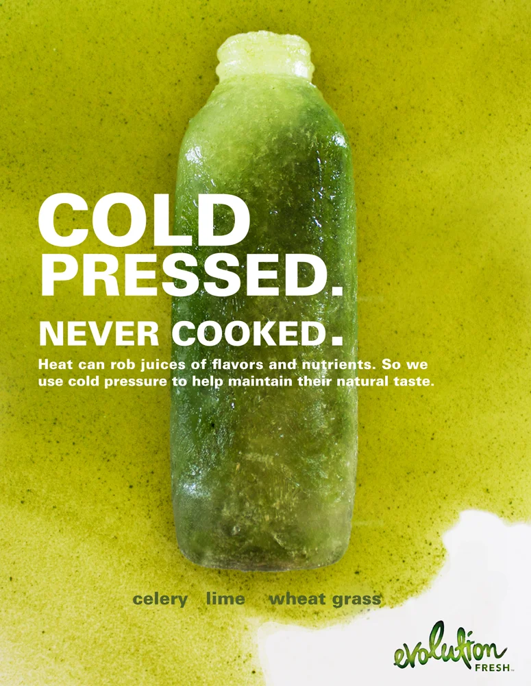
Evolution Fresh is a new company founded my the CEO of Naked Juice, who left to create a new product that was healthier than the Naked and Odwalla Brand. The Evolution Fresh advertisement campaign focused on what sets Evolution apart from the rest of the competition. Evolution’s juice is cold pressed, which is a new technique that has shown benefits in taste and health. For this ad campaign, it was important to educate the viewers on the importance of the cold press technique and why that was important, which set it apart from its competition. The phrase, “cold pressed. Never cooked” was created to emphasize the importance of the outcome of the juice. The ads feature the juice frozen in bottle form along with a liquid background to showcase the simplicity of ingredients and concept behind the company. The frozen aspect will connect viewers to thirst, simplicity, and the cold press process.
Please note, any existing businesses used or google images obtained (although modified) are strictly for educational purposes. No financial gains were made from these materials.
Marketing Photography
Architecture Study
Light Study
Portrait Study
Marketing Photography
The San Francisco Playing Cards were created to promote excitement around popular tourist attractions in the city. The design creates a whimsical theme that ties into the Victorian era of when they were built. To create the whimsical feel, a soft color palette was designed to play off the reversed night and day scenes. Simple geometries were used to connect it to the designs found in classical and Victorian architecture.
Fitness Gear Junkie is a fitness apparel company that exists inside the Crossfit community. The company was created by an individual after many people sought guidance on apparel and accessories that would help during the Workout of the Day. The client had asked for branding that included, 1. A skull image, 2. Focus on the eyes to portray "junkie," 3. A connection to super heros (Mavel, DC). The result is a geometrically sharp skull mask with intense eyes and a flat, graphical color treatment. A custom typeface was designed to accompany the image, which was created using the same grid as the skull mask. The custom typeface enhances the bold, intense Crossfit environment, while the blue color scheme mellows this intensity and brings a fresh aesthetic to the brand.
andrewfrlnd@gmail.com